Let me show you how to actually design a blog for success.
You don’t need any design skills to follow along.
I’ll share my honest, completely free strategy on how to design blogs based on what has worked on my four profitable blogs in the past 2.5 years.
Let’s get into the topic!
The Reality of Blog Design
Let’s be real.
Your blog’s design is not that important—especially if you don’t have tens of thousands of visitors yet.
Here’s how I see it:
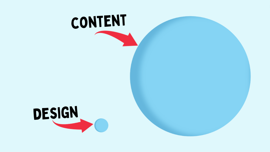
Here’s the best design advice I can give you: Choose the most basic free pre-built design and stick with it until your blog makes money.
Of course, once your blog grows into a proper business, having a unique design comes in handy. But that’s something to consider when you can hire a designer.
Of course, if you are interested in spending time designing your blog, be my guest! Later, I will show you exactly what to focus on when doing that.
But first, let me prove to you why using a free generic design is a good strategy.
My Experience #1
I never spend time on the blog design before the site makes money.
I always choose a pre-built theme and that’s it.
Look at the design of the blog that I launched 3 months ago:
Looks terrible, right?
The image, the logo, the outlook—doesn’t look like a blog from the 2020s, does it?
But look at the performance from the past 3 months:
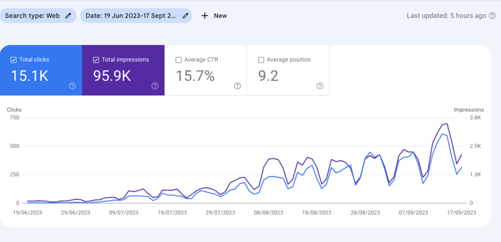
The site already gets 500+ clicks per day. Not bad for a site with such a bad design (or basically no design at all).
The reason this site is doing well is because it has 150+ informative blog posts.
These posts are ranking on Google search, bringing in a constant traffic flow.
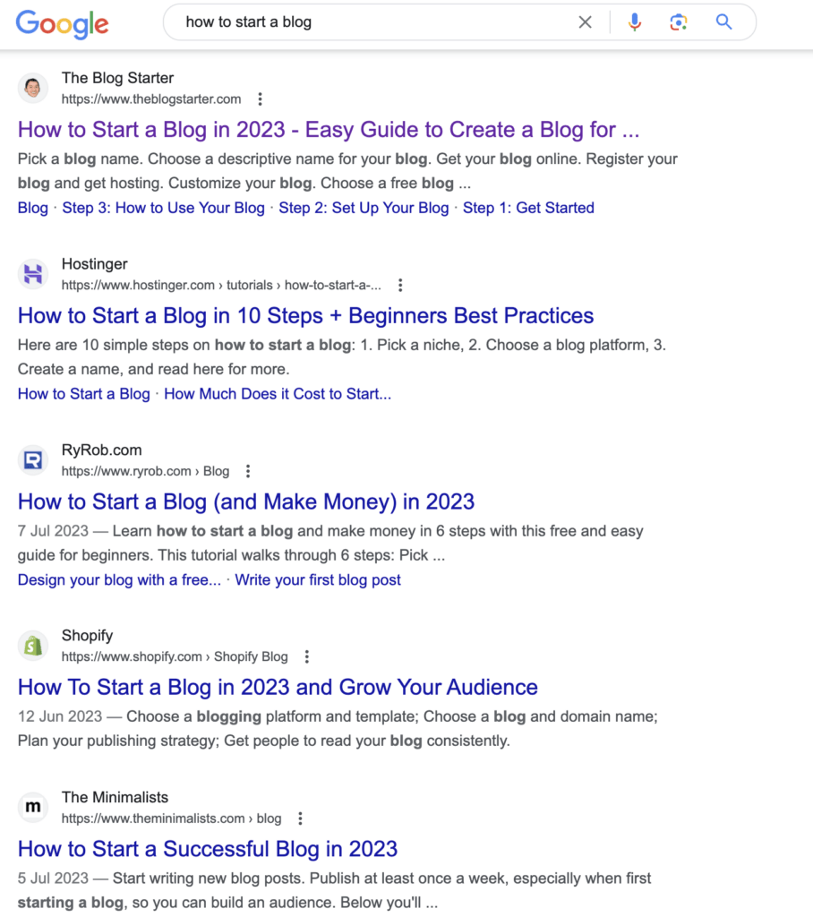
But why doesn’t the design matter?
When Google ranks your website, all they care about is the content and its accessibility.
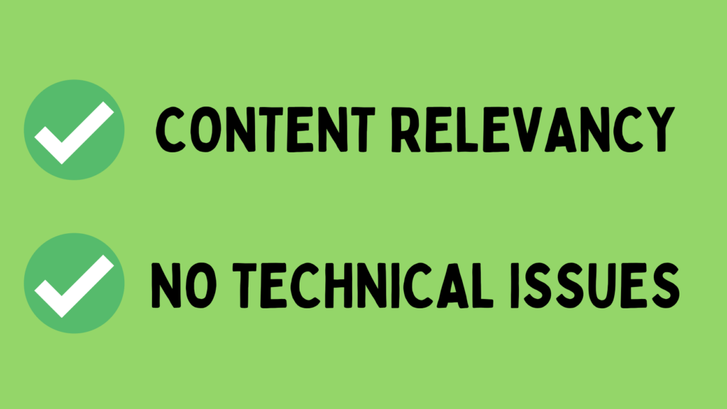
There’s no real person sifting through submitted blog posts and ordering them.
Instead, Google makes sure the site loads normally and that the content is relevant to what people search.
They don’t “see” the design of your site.
And the people using Google don’t care either. Searchers don’t see the design of your site before they click the search results.
Not convinced yet? Let me show you another example.
My Experience #2
I and my friend have a small accommodation blog in Finland.
During 2022, we had a blog that was basically not functioning. (Sadly, I have no screenshots of it anymore.)
But basically, the layout of the site was not far from what Wayback Machine shows:
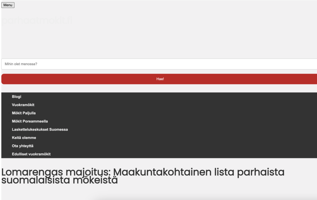
The design was so bad. We actually coded parts of it—not good.
As we hit 5,000+ monthly visitors, we decided to change the design in early 2023.
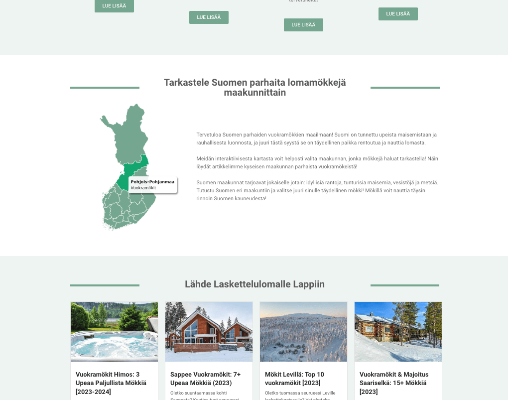
This new design already looks something. Not just a sketchy affiliate site.
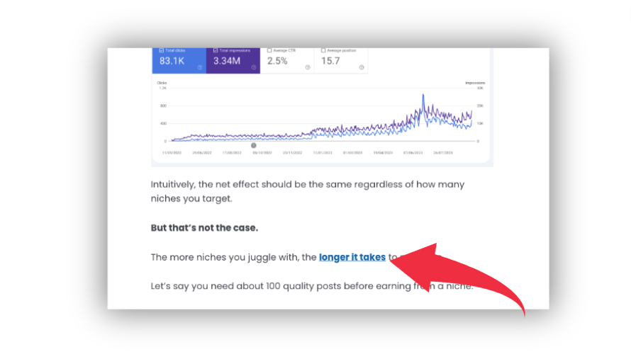
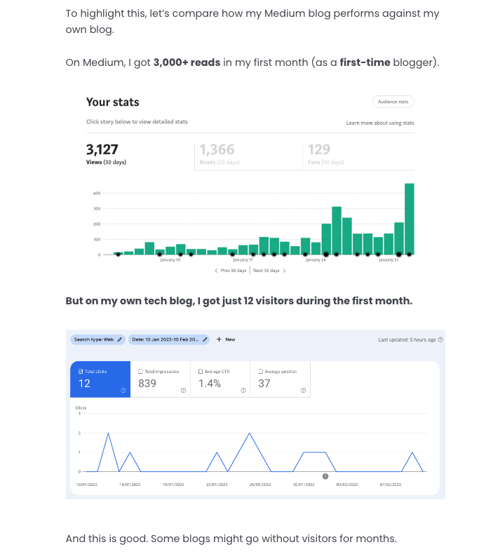
But look at the performance:
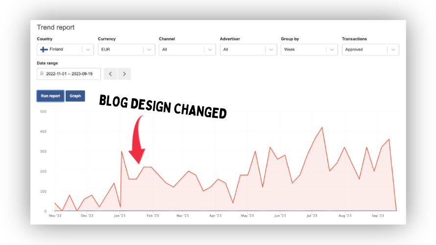
This chart shows how much revenue the site generates every week.
When we changed the design, nothing changed. We didn’t get any more (or fewer) customers.
In our books, the site went from 2/10 to 8/10 in usability and outlook. But it had no impact on the performance.
So we clearly could have continued with the bad design unaffected.
When you’re designing your blog, keep this in mind: The more time you spend on the design, the less time you have to write blog posts.
Instead of worrying about design, spend the extra time/money on writing blog posts.
Should I Not Worry about Design at All?
Don’t get me wrong here.
Blog design is important. But these days, most stuff happens behind the scenes.
Website builders like WordPress or Wix have free professional pre-built designs (or Themes as they call it.)
You can just install and activate one of these on your site.
These are built by real designers.
By using these themes, you’ve essentially used a professional designer to design your site.
All you need to do is just change those placeholder texts (and logos if you have one.)
Make sure to read: Biggest Blogging Mistakes
How about Standing Out?
Obviously, by using a free design, you’re not that unique.
There are hundreds or even thousands of blogs with the same design as yours.
So, how can you stand out on a blog that looks generic?
This seems a lot bigger problem than it is.
When you’re growing your blog, the design and uniqueness are the least of the worries you should have.
Let’s say that a unique design gives you a 2% boost in sales every year.
If your blog makes $1,000,000 in sales every year, a 2% boost means $20,000 extra. Stellar!
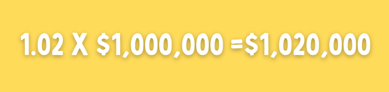
But if your blog earns nothing at all, adding 2% to that changes nothing.

2% increase to 0 is still 0.
To take home, having a characteristic design can help establish a strong brand. But that lies far in the future.
Your main goal should be writing blog posts until you get tens or even hundreds of thousands of visitors.
When your blog gets a boatload of traffic, just hire a freelance designer to stand out!
Now, if you’re still looking to do the blog design from scratch, let me show you the blueprint for doing it right.
Blog Design Best Practices
The most important part of designing a blog is the blog post layout.
There should be one blog post template that the site follows. It’s generally a big mistake to have different blog posts with different designs.
Anyways, a poorly designed blog post can have a negative impact on your blog’s success.
If the page is not accessible on mobile, Google might not even rank it.
And if the design looks like a Christmas tree, that might be too much for the readers.
A blog post should have a minimal design.
Everything that doesn’t add direct value for the reader doesn’t belong there.
Remember, if you’re using a pre-built theme or design on e.g. WordPress or Wix, all of this is already sorted out for you.
#0 Create a Design That Every Post Follows
You shouldn’t design blog posts separately.
Instead, create one common design that every post follows.
Then, if you want to update that design someday, every post will be updated automatically.
Also, it’s good for consistency.
It’s easier to remember a site that looks uniform across all the posts and pages.
#1 Readability
A blog post should look very minimal and basic. Leave as much room for the content as you can.
Avoid any special fonts, non-white backgrounds, or any other flashy elements.
The purpose of a blog post is to provide value to readers. The easier you make it for the readers, the better.
To make the post as readable as possible, make sure that the layout includes the following:
1. Narrow content width
It’s easier to read a post where the content doesn’t expand from all the way left to the right.
Think about Wikipedia (example post).
Those long lines are really hard to read and with a lot of text it can be hard to know which is the next line.
Make sure you create a design where the text is easy to follow.
2. Basic font, such as Poppins
Use one of the basic/default fonts on your blog posts.
(I recommend using Poppins so that your post doesn’t end up looking like a Word document, though.)
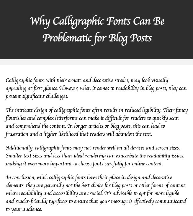
No matter which font you use, make sure it’s readable.
Don’t use calligraphic fonts. Those are super hard to read.
3. Big font for the headings
Mind the headings hierarchy!
Make sure that H2 is bigger than H3, and H3 is bigger than H4, and so on.
4. Underline the links
People with color blindness might not see links unless they have an underline.
To make your blog posts accessible to everybody, make sure the links are underlined.
5. Set the image size to the content width
Make sure big images don’t appear any wider than the content of the blog post.
But don’t force them to be exactly the width of the content.
Sometimes you might add smaller images that aren’t suitable as wide as the content.
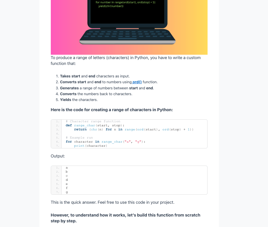
For example, here I’m forcing the screenshot of my plugins bar to be as wide as the content.
The icons look stretched and low-res. There’s no point doing this.
#2 Check the Competition
One of the best pieces of advice I’ve gained as a blogger is: “Look what others do”.
This applies to blog design too.
Do other blogs have blog posts with flashy colors, cool animations, or other such components?
Almost always, no!
If you’ve never designed a blog or blog post, look at your competitors.
For example, I think Medium.com nails it when it comes to blog post design.
Each post is narrow.
The background is white and the text is basically black.
No flashy colors, animations, or anything extra.
When I started a blog, I wanted to choose a design where blog posts would look like this.
It’s not a coincidence that all my blogs follow a similar design these days.
I’d recommend doing the same.
This is because designing a post is not the right place to get creative.
#3 Design as You Write
Whenever you write blog posts, keep the reader in mind.
Even if your posts are confined by the design you’ve created, you can still mess individual posts up.
So write with your audience in mind.
Make each post not just a wall of text. Instead, add formatting and structuring to each post.
I know this is technically not the designer’s job, but it’s still important to mention.
Here’s what you should keep in mind when writing posts.
Write short sections at most 2-3 sentences in length.
This is to avoid walls of text. Especially, on a mobile device, a long section easily looks overwhelming.
Also, break up your blog posts with images and other formatting elements.
Use images, illustrations, tables, bulleted lists, headings, and subheadings to make the post itself look nice.
Look at all the elements this example post has:
These have nothing to do with the design of the post.
Instead, these are the elements that one can add to individual posts.
To take home, create a simple blog post design that’s narrow content on white background. Then, further satisfy your readers with elements like images, tables, or lists.
Blog Homepage Design
Designing a blog post is straightforward—narrow content on a white background.
But nailing the homepage can get trickier.
The design of your homepage depends entirely on your website’s goals.
- Do you sell a course?
- Do you want to promote your merch?
- Do you have a YouTube channel?
- Or are you “just running a blog”?
If your blog is “just a blog”, I recommend adding recent posts to your homepage and perhaps a call-to-action to sign up to a newsletter.
Remember that the homepage design comes built-in with free themes on WordPress, Wix, or any other modern website builder.
But if you want to design from scratch, I recommend looking at other sites in your industry for inspiration.
Also, treat the homepage or landing page as a constantly evolving process.
It can be something very simple and basic now.
But once you get a ton of traffic and have built a strong community, you should consider doing some A/B testing and more careful design.
My Blogs
Let me show you what my blogs look like.
These websites have had millions of visitors in the past year and I’ve sold products worth almost $1,000,000.
All my blogs are WordPress.org blogs that either use pre-built themes or simple customizations I’ve made with Elementor.
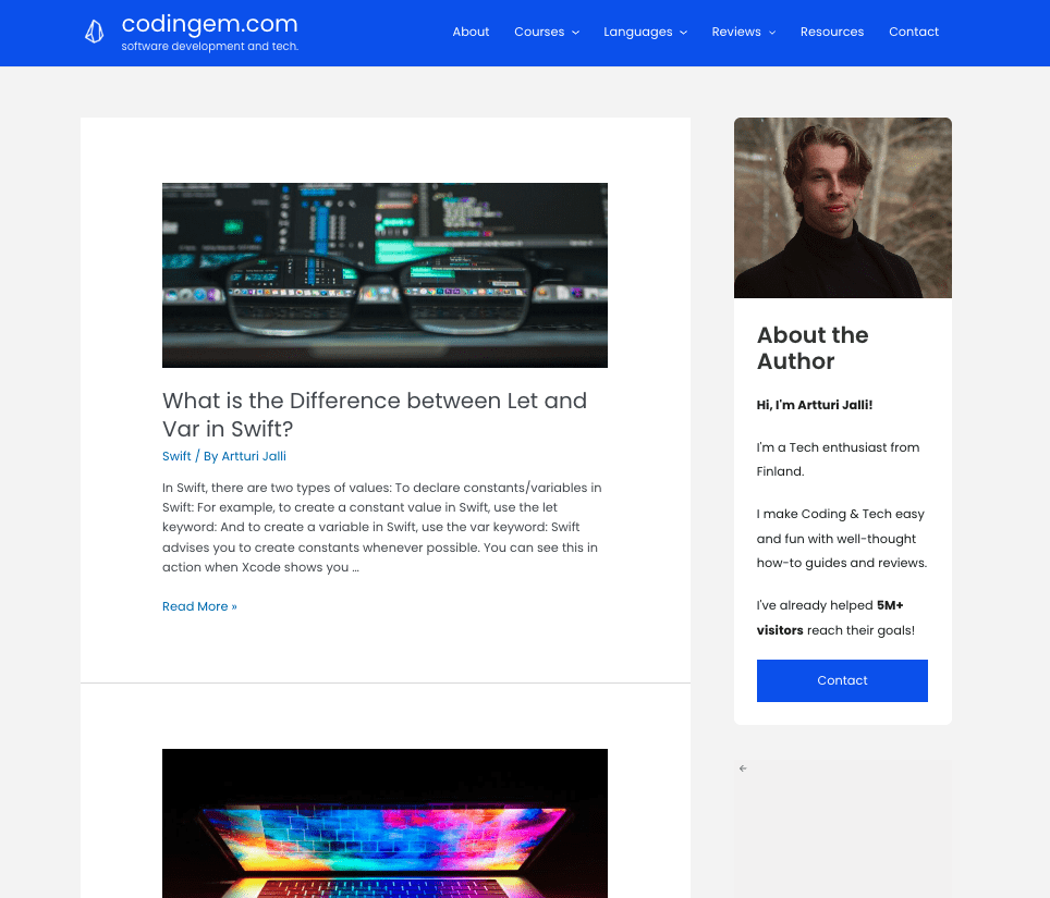
#1 codingem.com
Here’s the landing page of my tech blog, codingem.com:
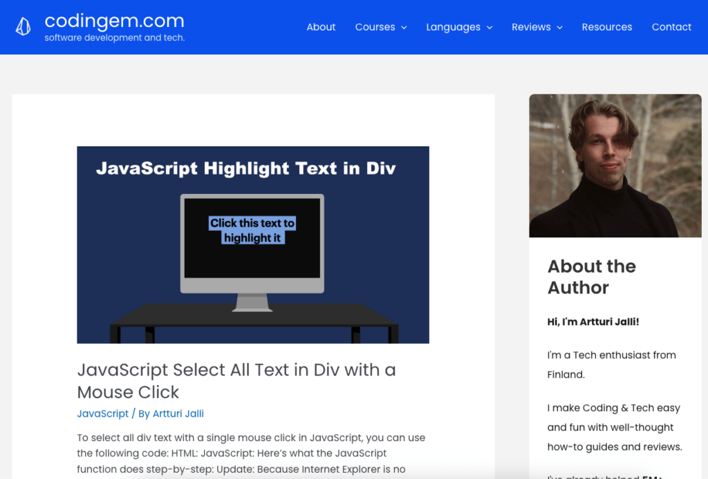
As you can see, it’s just a very basic blog archive page.
There’s a short introduction to who I am and then just all the posts I’ve written.
Speaking of blog posts, here’s what a post looks like on this site:
Very basic!
That’s just a narrow piece of content on a white background with basic font—exactly what a blog post should look like.
#2 bloggersgoto.com
Here’s the landing page of bloggersgoto.com, the very blog you’re reading right now:
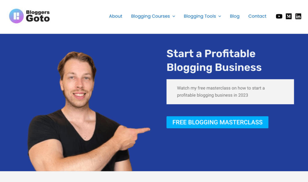
To design this landing page, I used the free version of Elementor.
I wanted to make the landing page have one clear message: I’m a blogger and I want to help you by offering a free course.
Once again, nothing too impressive.
I just looked at what others had done in my niche and created this design in 30 minutes with no design background.
A blog post on this site looks like this:
Very similar to the previous example, the post is just a narrow piece of content on a white background with a basic font.
And even though I used Elementor to design the homepage, this blog post theme came as is out of the box in the free Astra theme.
#3 parhaatmokit.fi
This one is my favorite when it comes to design.
Me and my mate did some customizations to the homepage with free Elementor.
Here’s what the homepage looks like:
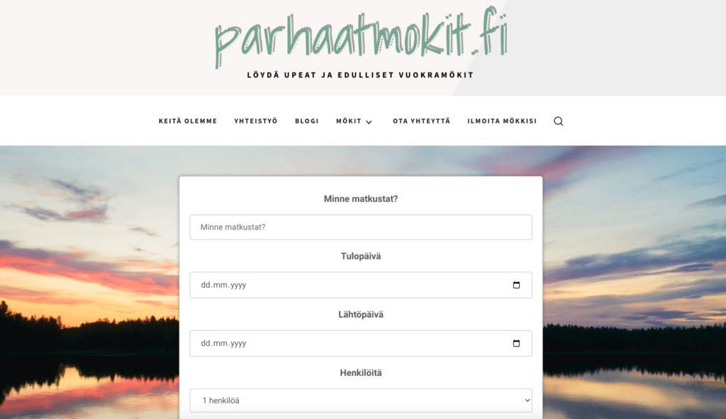
Fun fact: That search form is created with ChatGPT—my web coding skills weren’t good enough to do this efficiently. 😛
The point of this page is to deliver one message: Find the best rental cottages with us.
Once again, nothing too special. Just a basic navigation menu and a search form.
And here’s an example of a blog post on this website:
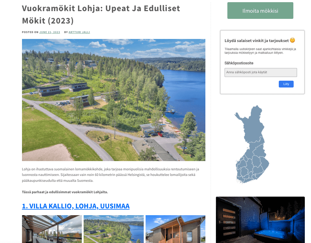
This post template is once again nothing but narrow content on a white background.
But unlike the previous sites, in this one we have a sidebar to quickly access our email list, all the rental cottages, and recent posts.
Very minimal, very basic, yet powerful and effective.
#4 logilax.com
This one is my youngest site.
On a new site, I want to dedicate little time to anything else than writing.
Here’s the landing page:
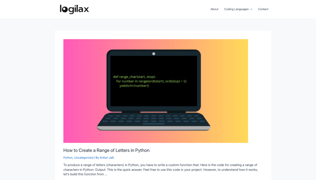
This is the most basic theme ever.
But it does its job. The site has already crossed 10k visitors and is getting 500+ visits every day.
A blog post on this site looks something like this:
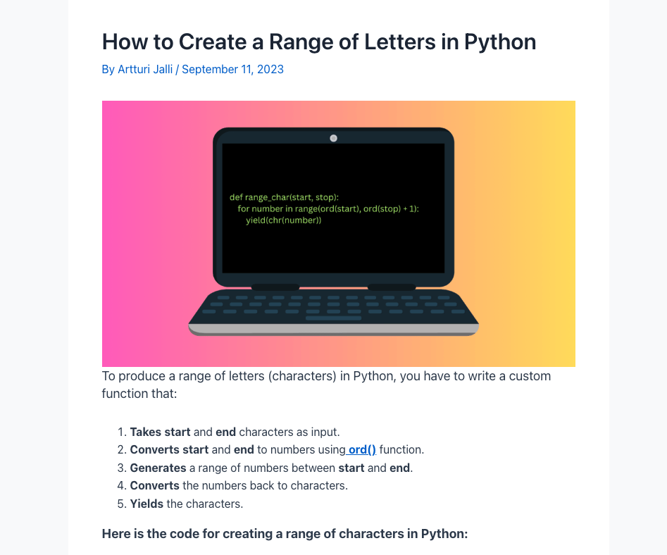
As you can tell, one thing is common in all blogs that I operate: Content width and simplicity.
This site tells one story: Simplicity is beautiful.
At the end of the day, blog posts are built to help people find solutions to their problems.
The smoother you make the process for the reader, the better.
Make a blog post look very minimal and basic. No need to overdo things or try to get creative here.
Use Other Designs for Inspiration
I think the best way to design a blog from scratch is by checking what others have done.
By blindly designing, you’ll for sure stand out but in a bad sense.
The blogging landscape is changing all the time.
For example, 15 years ago, nobody bothered designing a blog for mobile devices. These days, in many niches, the majority of people read blogs with their mobile devices.
A design that isn’t responsive on mobile would be a catastrophe.
What I recommend doing is to see what other peole are using in your niche.
If you’re running a tech blog, check other tech blogs and their designs.
I never copy other’s work, but almost always get inspiration from others.
Wrap Up
Don’t spend time on your blog design—unless you really want to do it.
The design of a blog doesn’t matter at first.
All you need to worry about is writing blog posts that start ranking on Google.
Once you get a nice income from your site, you can hire a designer.
Until then, just use a basic free design on your website builder.
Thanks for reading. Happy designing and blogging!